
A Community Moving Forward Together
Wahoo, Nebraska is a community with plenty to be proud of. Located between Lincoln and Omaha, the Saunders County seat is supported by organizations working to strengthen local government, encourage business growth, promote philanthropy and create an even better place to call home. The Greater Wahoo Development Foundation, for example, has supported business recruitment and expansion in the area since 1988.
When leaders from several of these organizations approached Filament, they believed Wahoo was on the verge of something special. New leadership had created an unprecedented level of collaboration among the City of Wahoo, Wahoo Chamber of Commerce, Wahoo Community Foundation and Greater Wahoo Development Foundation.
They wanted a community brand that would build on that momentum, demonstrate their unity and feel authentic to the people who live there.
Discovering Wahoo’s Quiet Confidence
Our work began by listening. Through research and discovery with residents, business owners and other stakeholders, three defining qualities rose to the surface. The people of Wahoo expect excellence, thrive on competition and want their community represented honestly, without embellishment.
Together, those qualities revealed something distinctive: a quiet confidence and humble swagger shared throughout the community. Wahoo did not need a brand that manufactured a new identity. It needed one that clearly expressed the identity its people already shared.
That insight led to “We Are Wahoo,” a simple, declarative motto rooted in belonging and self-belief. It recognizes that whether someone is from Wahoo by birth or by choice, they can proudly call it home.
One Brand with Room for Distinction
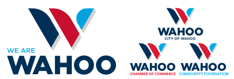
Filament created a unified family of logos for the four participating organizations, giving each entity a distinct identity within a recognizable community-wide system. We also developed the community narrative, brand standards and foundational materials needed to put the identity into practice.
Bringing the Brand into the Community
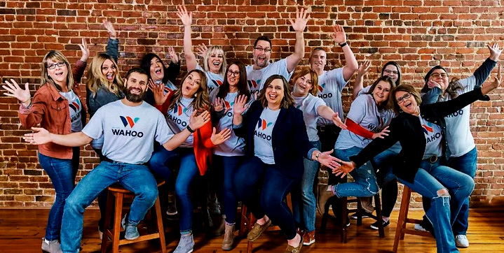
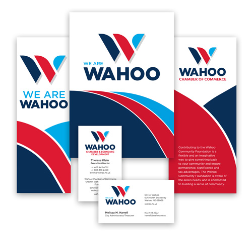
Because a brand only becomes meaningful when people embrace it, we helped Wahoo plan a coordinated public launch. Narrative cards explained the ideas behind the brand, while banners and T-shirts brought it into the community. Business cards, letterhead and other implementation materials helped the participating organizations present the new identity consistently from the start.
Today, these organizations continue working together to support Wahoo’s residents, businesses and future. We are proud to have helped give that shared commitment a unified voice and a visual identity grounded in the community’s own words.
They are not simply located in Wahoo. Together, they can say: We Are Wahoo.