
A City Shaped by Life on the Lake
Lake Quivira, Kansas is more than a lake, a country club or a private residential community. It is an incorporated Kansas city with its own government, history and civic responsibilities.
The community traces its roots to the 1920s, when it began as a recreational destination outside Kansas City. Over time, seasonal cottages became year-round homes, and Lake Quivira developed into a close-knit residential community. When nearby Shawnee considered annexing the area in 1971, residents successfully petitioned to incorporate. Lake Quivira officially became a third-class city on July 12 of that year.
Yet people outside the gates did not always realize Lake Quivira was a city. Its identity was often intertwined with the Lake Quivira Country Club and Lake Quivira Foundation. City leaders wanted to clarify that distinction while giving residents an identity that reflected what made their community special.
Finding the Spirit Behind the City
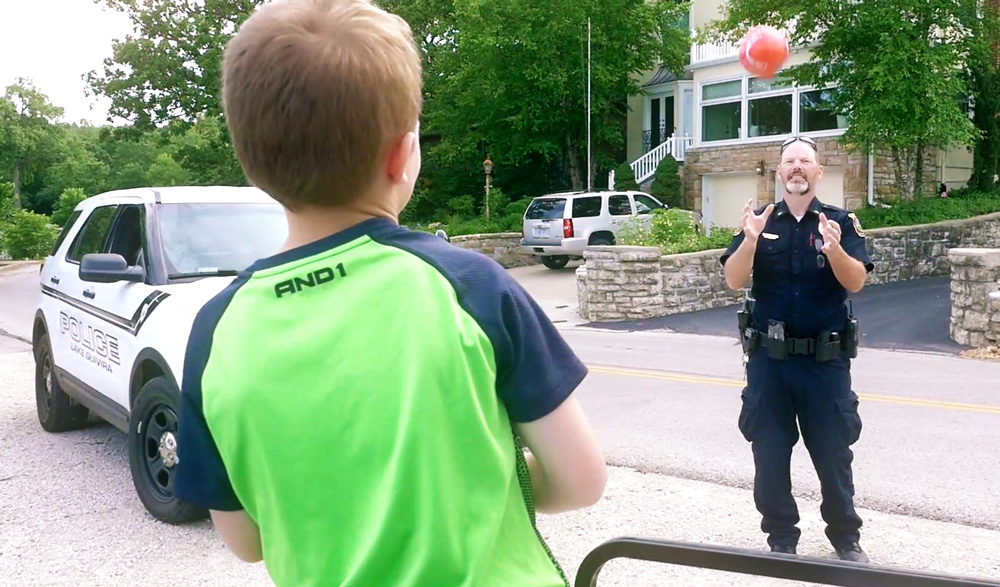
Filament’s branding work focused on the qualities that unite Lake Quivira residents. The City does not have local businesses or many of the departments associated with larger municipalities. Instead, community life centers on the lake, outdoor recreation, shared activities and strong relationships among neighbors.
That active, family-oriented atmosphere became the foundation for the new brand. Rather than focusing only on municipal functions, the identity celebrates how residents unite, support one another, play and engage.
The resulting motto, “Lake Life Happens Here,” captures both the community’s defining physical feature and the experiences that connect its residents. Its flowing visual identity suggests water and movement while giving the City a distinct presence of its own.
Connecting the Brand and the Community
A new identity also created an opportunity to strengthen communication between the City and its residents. Filament developed a new content management system website that gave municipal information a clear, accessible home while introducing the brand to the community.
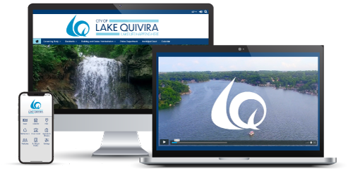
We also created a community branding video built around the new narrative. With the narrative serving as its voiceover, the video highlights the active lifestyle, natural setting and sense of belonging residents value. A Brand Standards Guide provided the City with the tools to apply its identity consistently across future communications.
Lake Quivira’s brand does not try to make the community into something new. It gives a voice and visual identity to the close relationships and adventurous spirit that were already there.
We’re proud to have helped the City tell its own story and celebrate a place where neighbors become friends, the lake becomes a backyard and community feels like family.