Every year your grandma brings a fruitcake to your holiday gathering. It’s old-fashioned, disgusting and goes largely untouched. The only people who eat it are either just being polite or are also, you know, “of that age.” But she grew up on it, she loves it and insists on continuing the tradition. So we humor her instead of asking her to bring something more palatable.
As distasteful as fruitcake is, continuing to use two spaces between sentences is equally stomach-churning. It’s an outdated convention, it’s counter-productive and it makes you look bad.
So, I’ll be that guy… Grandma!? Stop with the fruitcake!
 Two Spaces for Typewriters
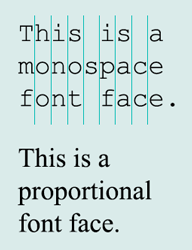
The typewriter, though a remarkable invention, is largely responsible for the single vs. double space schism. Typewriters used monospaced fonts (meaning a lowercase “l” occupied the same horizontal space on paper as an uppercase “W”). This left uneven spacing within words and made it visually challenging to distinguish between the end of one sentence and the beginning of another. To accommodate, it made sense to put two spaces after a period.
What doesn’t make sense… is still hanging on to a rule created for typewriters almost half a century after they’ve become extinct. Imagine a city planner who insisted on building roads based on horse travel. They’d be laughed out of the room.
One Space for Computers
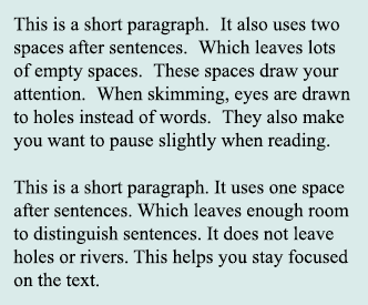
 The vast majority of fonts we use on computers (read: not Courier New) are proportional fonts, which condenses character spacing within words and help our eyes easily distinguish between sentences with only a single space between them. As a result, using two spaces is not only unnecessary but also makes your writing look worse. Your paragraphs become prone to rivers of white and contain big white spots because of the conspicuously large spacing. When we encounter a large space while reading, the natural tendency is to pause; and the holes naturally draw attention away from the text. Both these things make reading harder.
The Universal Standard
Every book you’ve ever read uses one space. Every reputable magazine you’ve ever read uses one space. Same with newspapers. In fact, any publication assembled by a person with typography expertise uses one space.
Every major style guide also favors one space between sentences:
Even Microsoft Word has started to flag two spaces as errors!
The Experts Are Unforgiving
When The New York Times columnist Farhad Manjoo queried typographers, they didn’t mince words. “I talk about ‘type crimes’ often,” said Ilene Strizver, “and in terms of what you can do wrong, this one deserves life imprisonment. It’s a pure sign of amateur typography.”
“It’s so bloody ugly,” added David Jury.
In an article for The Atlantic, James Hamblin admitted “I plan to teach my kids never to reply to messages from people who put two spaces after a period.” While he is (probably) exaggerating, this shows how seriously experts take this affront to good typography.
Your Credibility Suffers
You may not know it, because the conversations happen behind your back, but publications using two spaces are regarded as amateur. Using a rule built for an obsolete machine makes the author, and by extension their organization, look outdated which calls your credibility into question.
See for Yourself
Still not sure what is the most widely accepted course of action? Do any kind of Google search on the topic. The Internet is filled with articles ridiculing the use of two-spaces. You’ll find article after article saying the same thing: get with the times and start using one space. Admittedly, there is one study out there claiming scientific proof that two spaces make reading easier….
Shady Science
Debate a double-space die-hard long enough, and eventually they’ll point to a 2018 Skidmore College study that found that readers were slightly more efficient (just 3%) reading text that double-spaced sentences. But the study had a glaring flaw: it used Courier New, the kind monospaced font that necessitated double-spaced sentences in the first place! So all this study proves is it was a good idea to use 2 spaces on typewriters, but has no relevance to proportional fonts.
The Exceptions
By now, you may get the feeling I feel pretty strongly about this subject (BTW – don’t get me started on using all caps for emphasis!). But there are two instances where using two spaces is appropriate. One is when using monospaced fonts. The other is on the church newsletter. Mabel has been doing these since forever and, I have to admit, there’s something comforting about seeing those big ol’ gaps when reading about the church’s holiday potluck. In fact, I’d also go to that holiday potluck and grab a slice of her homemade fruitcake, too. I’m not a total monster.
The $64,000 Question
By now you’ve survived this avalanche of evidence that using two spaces between sentences is outdated, counterproductive and calls your credibility into question. So the big question is: why are you still doing it?
Still not convinced?
- Nothing Says Over 40 Like Using Two Spaces After A Period
- Why You Should Never, Ever Use Two Spaces Between Sentences
- Double Space After Period is Wrong, Says Microsoft Word
- Ending the One Space vs. Two Spaces After a Period Argument
- APA Style Guide Endorses 1-Space Rule
- Google Search: 1 space or 2 after a period
Filament Protip
All of our service area leaders have dozens of years of experience. These are protips they’ve picked up along the way that you can use right now to solve common issues.
